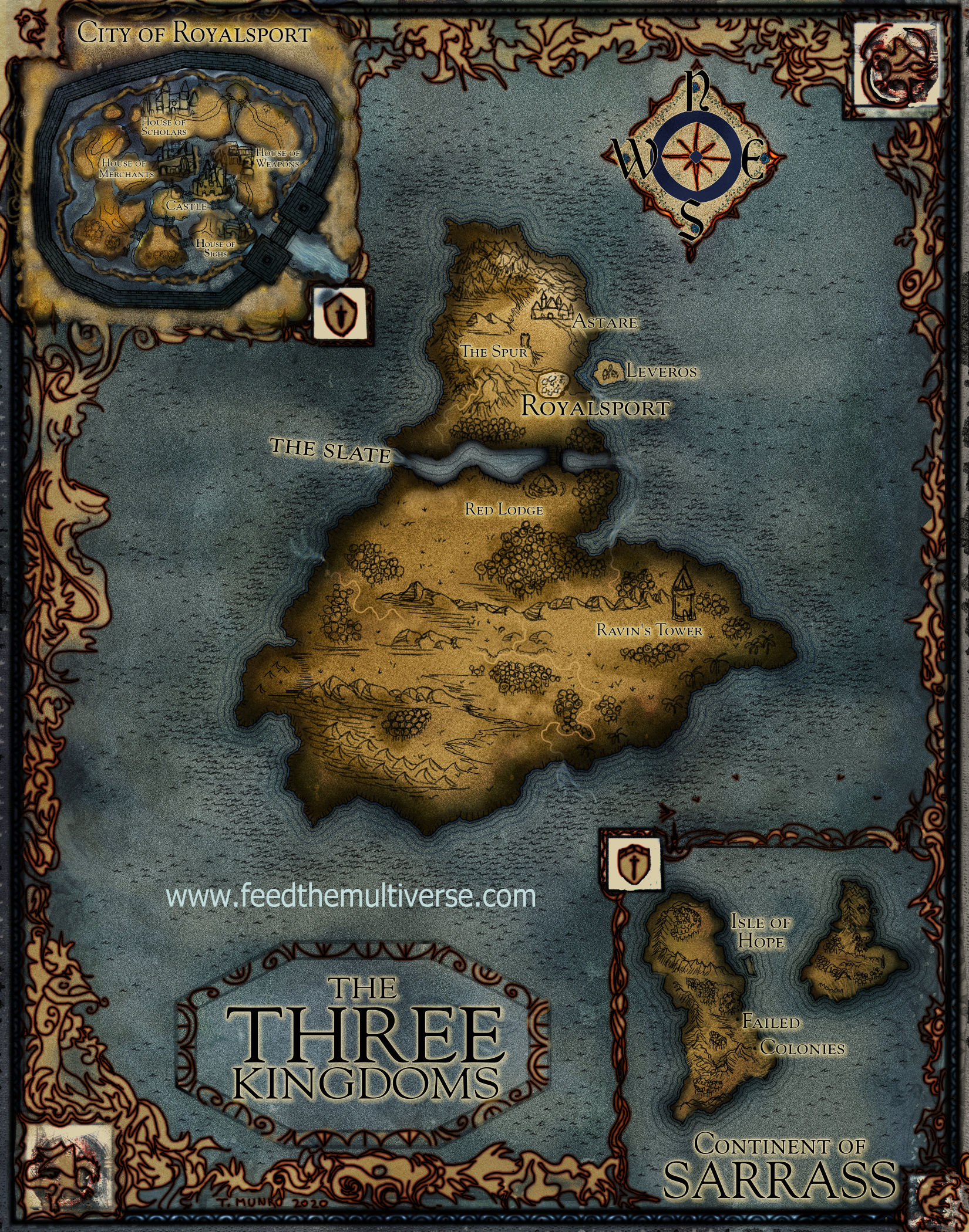
The Three Kingdoms Map for Novel Renewal by Morgan Rice
Another map in a series, there are two earlier maps for this series. Ringworld Rise of the Dragons map with frame and blue water
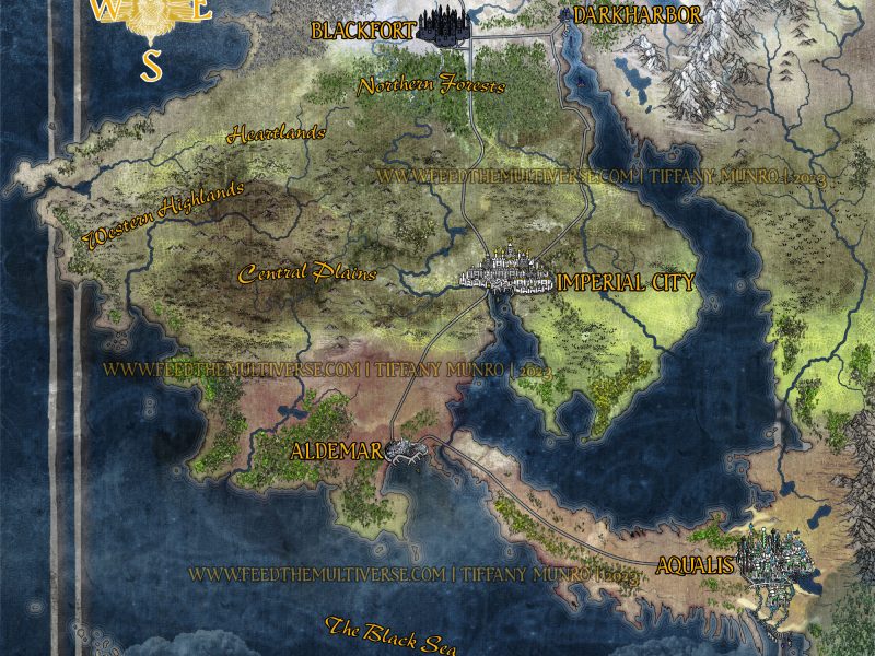
And the Escalon map, my favorite from the Rise of the Dragons map series,
Thanks for reading, and be sure to check out the upcoming book Renewal and the many many other dragon books by Morgan. Seriously, she’s written dozens of books. If you like dragon fantasy it’s unlikely you’ve missed her work, but if you haven’t gotten to it yet, you can fill your bookshelves and more will still be coming!
Fun fact: my aunt reads her books. I have never bragged that I did maps for her books though.
The Evolution of the Map
This map went through several severe edits to reach what the client desired, shown at the beginning. It actually started out bright blue, and then shifted to what you see below, with the original fonts and blocks for the labels.
I messed around with a fancy medieval art border, which I like. That was maintained into the final. However, you will see below a bit of what got lost in the edit.

Now, I think they were right in asking for the change to the edge of the continent and the waves. That I like better than the original glowing wave trim I tried. But I miss my roadsign style inserts, and I really think the request to make the city names tiny and remove the outlines on them was a mistake. In retrospect, I think the correct decision was one that was not tested. A legend with numbers on each island in the city would have allowed for the visibility of the island layout, with more legible text. The text on the final is almost illegible to me and I have 20/20 vision, however, they kept asking for it to be smaller and smaller and more discrete. And my clients always get what they ask.
I also preferred how there was more negative space with the lighter backgrounds on the inserts. While I do like the final outcome of the dark and mysterious water, and the border, I like the Escalon map better than this one myself.
However, I never argue with a change request. They wanted it darker, grainier in texture, moody, and even in tone, so that’s what the final map is. 🙂 I thought I would show the original version of the labels though, so that my commissioners can see that I am willing to experiment and always willing to accept your criticism and feedback when we are working on a map together. Your vision will be more important than mine. It might wound my pride a bit when I think it’s not the best idea, but you will get what you want, no complaints. 😉
If you commission me, don’t be afraid to request changes. I always account for a reasonable amount in every artwork I undertake.


