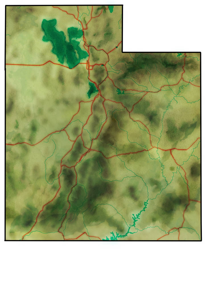
Topography Map of Utah Watercolor (bonus mini tutorial writeup)
I’m proud of this simple Utah watercolor map. Because I used existing topographic maps in reference, I was able to create it quickly! We live in a glorious age of free data. Mostly I create fantasy style images and I’m pleased with the subtle accuracy. This was for a client with several offices in Utah who wanted a gentle map to highlight any of their locations. So no graphic design elements were added.
I don’t often talk about the creative process but I had to develop a method to create this watercolor style of topography – so I’m going to write a little bit about it!
I’m slowly beginning to work at integrating small amounts of GIS data into my map illustrative work. So parts of this map are hand drawn elements and parts were extracted from data sets.
Mini Watercolor Topography Map Tutorial
First, I created an outline of Utah and fit in a watercolor stock texture base.
I hand traced all of the waterways and highways so they wouldn’t have the stark vectorized lines generated from GIS data. Then, I duplicated the road layer, and blurred it a little. One road layer I set to hard light, and the other to vivid light.
I put a blur on one water layer, and set it to multiply. Then, I went in on one other layer and hand drew a little bit of ‘watercolor’ spots using my bank of watercolor style brushes. I do my illustrative work in Manga Studio and Clip Studio. Brush sets I use include Frenden’s brushes and Flyland’s brushes, some of the best traditional media brushes I’ve ever used. So props to them. For the record, I used the Micron .3 for most of my inkwork, and several different watercolor brushes for the water effects.
This was it for the highways and rivers.
To create the topographic watercolor, I traced 5 different increasing height maps of Utah. Beginning from a lightest olive green to the darkest olive green, I selected 5 colors. They increased in ruddy saturation rather than going directly up in brightness. You may observe this effect if you are attentive to subtle color differentiation.
First I traced all of the lowest areas and filled those in with a flat light green, and then I ran the gaussian blur filter. On the same layer, I again traced the next height layer in a slightly darker color, blurred, and repeated this five times. So in the end, the lightest color was blurred 5x more than the darkest height I mapped. Then I created one final layer above this. I hand drew in a few more dark, saturated values to create a subtle effect of mountain peaks.
Finally, I selected a brown watercolor and coffee stain texture set. I positioned bits of these watercolor textures to match darker/higher areas in the region. This overlay pulled all of the colors together by lending a tint.
Data Fun Times!
To source information for the height map of Utah, I found the best resource was the government of Utah. Anyone who’s curious to poke around can begin here on the Government of Utah GIS page. There’s incredible content available there for anyone curious about the world of mapping.
I suppose I thought I’d write a bit more about this map since it wasn’t all fictional. I went out of my way to make this subtly accurate and the client was thrilled.